|
|
Location: GUIs >
Windows >
Chicago Beta-1 Windows User Interface Style Guideline 4.0 As in previous version of Windows, one of the reasons why applications
are easy to learn is the fact that they look and act alike. With
Chicago, Microsoft has taken great steps to improve the basic common controls
that all applications can share. These controls have evolved based
on user feedback and extensive usability testing here at Microsoft.
Applications that use these controls provide the users with commonality
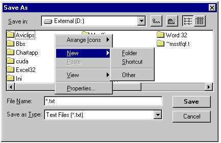
and improved features-such as being able to create new folders in the Save
As dialog box-without having to switch to the Explorer or File Manager.
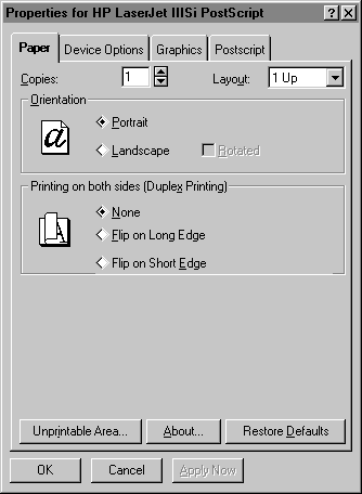
Figure 98. Save As Common Dialog In the new Printer Properties dialog you can see examples of some of
the new controls with make access to features even easier for users.
At the top of the dialog you can see tabs for "Paper," "Device Options,"
Graphics," and, in the case of the printer shown in Figure 99, "Postscript."
Clicking any tab presents the user with properties for that particular
area. Another new control available to all applications is the Spin
Control next to the number of Copies.
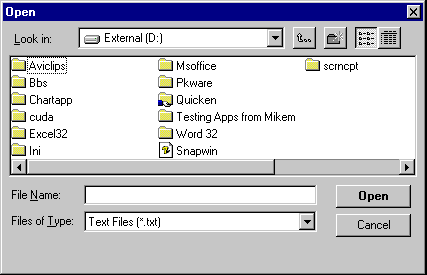
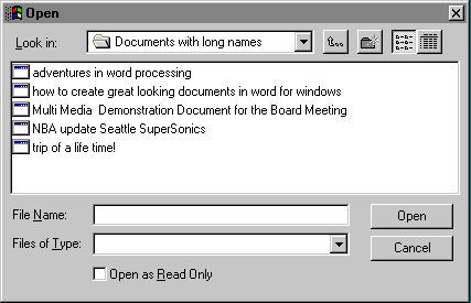
Figure 99. Sample Tabbed Dialog Box Property Sheet The new Open Dialog allows the user to see long filenames, and navigate the entire PC, and connected network to look for files to open.
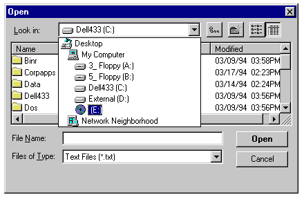
Figure 100. Open Common Dialog The new Open dialog also uses Tree Lists to allow the user to navigate through the hierarchy of the hard disks attached to the computer and through the network to which the computer is connected.
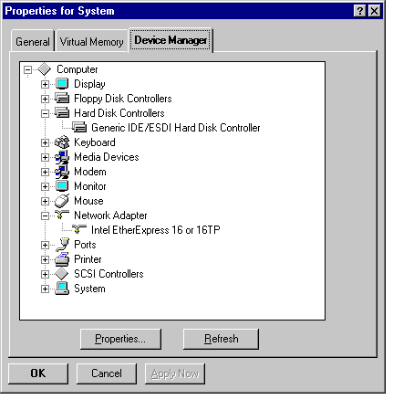
Figure 101. Open Common Dialog Provides Easy Access to Network Resources Figure 102 shows another new control that makes viewing and accessing
hierarchical information even easier. This is a tree list control found
in the property sheet for the Device Manager in the System section of Control
Panel. As users expand and collapse the tree, they can see information
relevant to their topic of choice.
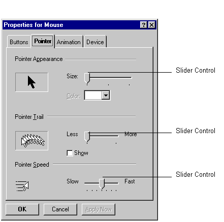
Applications no longer have to include their own custom slider controls.
Figure 103 shows the new common slider control included in Chicago.
Figure 103. Sample Slider Control There are many new common controls, tool bar, status bar, column heading, tabs, slider, progress indicator, rich text control, list view, tree view... and much more. Great Chicago applications will use these new controls to make the users access consistent across applications and make the entire system much easier to use. Long Filename Support As you have seen by now, there is a much improved new shell for Chicago. But the shell itself is only part of what is really here for users. Now an application that takes advantage of this new shell support can offer their users long filenames and direct file viewing. Long filename support means that documents no longer have to be limited to eight characters for names. They now can have up to 255 characters. Instead of "23ISM_JB.doc", you can name a file "Status report July 23 regarding the ISM project for my boss Jim Bernstein"-a title that really tells you what the document is about. Applications that support the Viewer capabilities in Chicago provide users with a quick and easy way to view their documents directly from the shell without launching the application.
Figure 104. Chicago Applications Support Long
Filenames
|
