|
|
Location: GUIs >
Windows >
Chicago Beta-1 Powerful Experienced users glean many of the same benefits from the Start Button and the Chicago Taskbar as do beginners-quickly launch a new program, quickly task switch, etc. However, experienced users need more. They need a powerful way to browse and manage file hierarchies be they local or somewhere else. They need to be able to customize the UI to suit their needs and tastes. They need to be able to take shortcuts to get tasks done more quickly and efficiently. They need to be able to do more. The new Chicago UI enables the experienced user to do more, as you will see in the coming pages and during youre own explorations. The Explorer: Power Browsing and File Management
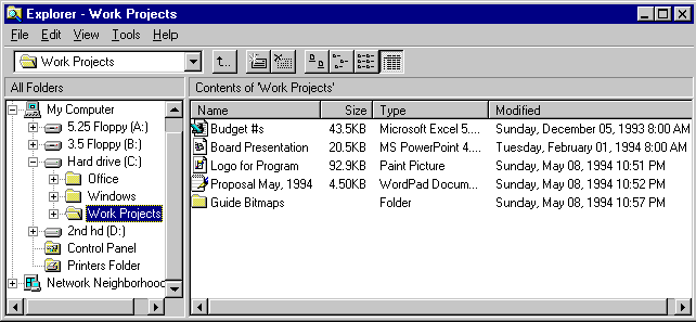
Figure 14. The Chicago Explorer One Chicago developer describes the Chicago Explorer as the "File Manger on steroids". It is powerful, flexible, efficient and extensible. It also solves many fundamental problems with the Windows 3.1 File Manager, like having to have a new window for every drive. For many Chicago power users the Explorer will be the primary interface. The best way to understand the Explorer is to experience it firsthand, however, here is an overview of its major features:
Shortcuts Shortcuts are an abstract but extremely powerful tool for increasing efficiency and are especially useful in a networked environment. A user can create a shortcut to any object (such as file, program, network folder, Control Panel tool, disk drive, and so on) in the Chicago UI and place it anywhere else in the UI or in an application. When this shortcut is opened the object that the shortcut is "pointing" to is opened. For example, a shortcut to "My network folder" could be created and dropped on my desktop. When the shortcut is opened, it actually opens my network folder which is out on some network server somewhere. Shortcuts are represented just like regular icons, except that in the lower left corner there is a small "jump" arrow, as shown in Figure 15.
Figure 15. Chicago Shortcut Icon A shortcut can be deleted without affecting the object to which it points. A shortcut can be created by selecting an object and choosing Create Shortcut from the File menu or from the right mouse click context menu. If shortcuts are created on an object that was created since Chicago was installed, then Chicago keeps track of renames. This means you can create a shortcut to \\Server\Share\Public Folder and put it on your desktop. Then if you or anyone else renames the network folder, the shortcut will still work regardless of the fact that the name of the folder it points to has changed. You can also rename shortcuts themselves. Uses for shortcuts are virtually limitless, but some common powerful uses for shortcuts include:
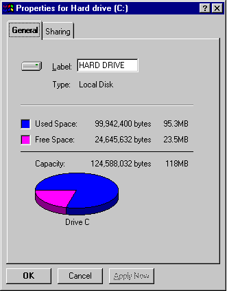
Properties Everywhere Property sheets are an all-pervasive feature in Chicago. All objects in the UI carry context sensitive properties that can be accessed and customized by selecting File Properties or by right-clicking. Good, consistent, easily accessible properties sheets have been a favorite of power user testers to date. Properties will be illustrated through a series of "Try This" tips. Try This-Rename Your Hard Drive in Disk Properties
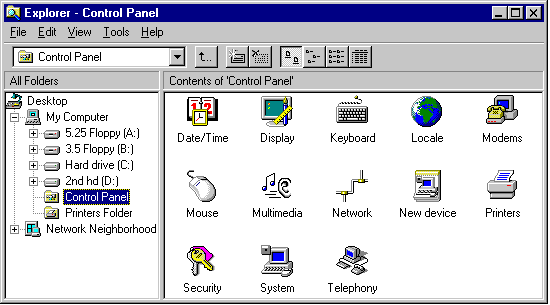
Figure 16. Chicago drive properties [...] Right-Clicking Everywhere Right-clicking, like properties, is another all pervasive, context-sensitive feature of Chicago. (Right-clicking refers to clicking the secondary mouse button because most right-handed people set their mouse options to use the left button as primary and the right as secondary.) Usability tests have shown that in general, right-clicking is not a feature that novices discover or remember, therefore, the vast majority of functions performed on the right-click can also be performed by selecting the corresponding menu commands. However, right-clicking as a short cut for the most common actions to perform on an object has proven to be another very popular power user feature. The power of right-clicking is best illustrated through a series of "Try This" tips. [...] Control Panel: The Consolidated Control Center The objective of the Control Panel special folder in Chicago is to consolidate into one location, all command, control, and configuration functions. A problem with Windows 3.1 was that these functions were difficult to find, use, and remember (such as, Windows Setup to change video resolution). The UI team has striven to create distinct and memorable visuals for all important functions and offer previews where appropriate. Individual Control Panel tool functionality will be covered in the section to which it pertains (such as, "Network" in the "Chicago networking and Systems Management" section of this guide).
Figure 18. Explorer larger icon view of the Control Panel There is one Control Panel tool, however, that pertains to customization of the UI itself, "Display". Display gives the user total control over the configuration of the Chicago UI allowing for personalization. Its four tabs are:
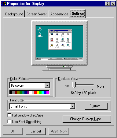
Figure 19. Chicago Display Properties Find Files or Folders: Easily Location
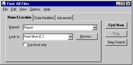
Figure 20. Chicago's Find Files or Folders
Figure 21. Search in Windows 3.1 A powerful new Find utility is built into Chicago. It goes far beyond the minimal functionality of the File Mangers Search utility in Windows 3.1. Features include:
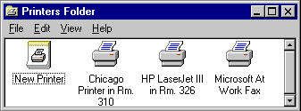
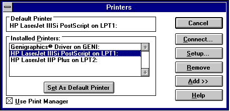
The Chicago Printers Folder offers one stop shopping for printer management and configuration. It replaces the troublesome Print Manger and Printers Control Panel Tool from Windows 3.1.
Figure 22. Chicago Printers Folder
Figure 23. Printer Configuration from Windows 3.1 Font Settings: More Powerful Font Management and Preview
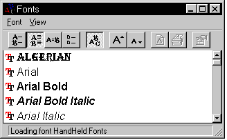
Figure 24. Chicago Fonts Settings
[...]
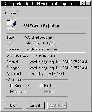
Figure 30. Properties for a File, Showing New
File Attributes
|
