|
|
Location: GUIs >
Windows >
Windows 1983 Comdex Demo
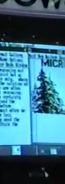
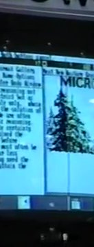
Dan Bricklin, the co-creater of VisiCalc, posted a YouTube video of a walk through of the Fall 1983 Comdex . One of the more prominent features is a demonstration of the yet unreleased Microsoft Windows. To set the stage: The Xerox Star was old news, Visi On was announced the year before, and Apple was already shipping the Lisa. The buzzwords of the day revolved around user friendliness and office integration. The unveiling of the Macintosh and the official release of Visi On were just around the corner. The most stunning thing about this video is how much more complete Windows looks than compared to the December 1983 Byte Magazine article. This video was supposedly taken before that on November 23, 1983. It takes time to get an article in to a printed magazine, even more so back then, but the differences seem staggering. Here is a direct link to the relevant part of the full video: Fall Comdex 1983 Part 3 of 3 (starts at about 7 minutes in) There is also a shorter excerpt video here: Fall Comdex 1983 Excerpts
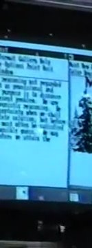
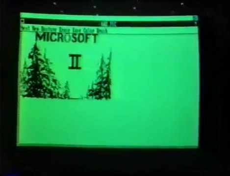
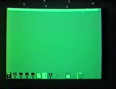
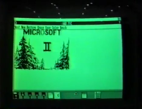
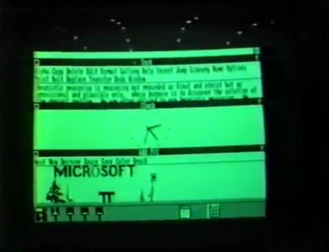
The demo starts with all windows closed, but a number of programs running, minimized to icons in an area at the bottom of the screen. There are a number of paint programs open with different images. A text editor, clock, and sample calendar are also running. It is possible to drag the icons around. They refer to the icon as the smallest form of a window. The clock icon appears to indicate the current time. In the icon area, the cursor takes on a different form. The Byte magazine demo did not show any icons at all. It also did not appear to have a clock or paint program.
The Byte demo used the entire screen.
These were not present in the Byte demo, and do not appear in any known later versions.
During the demo, they emphasize that Windows provides layout such as menu arrangement, instead of being controlled by each individual application. Applications redraw their content to fit the new window when resized.
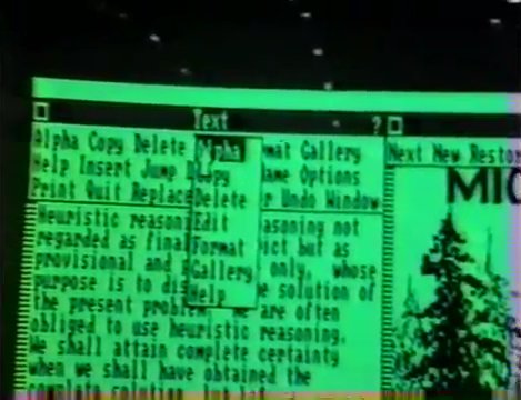
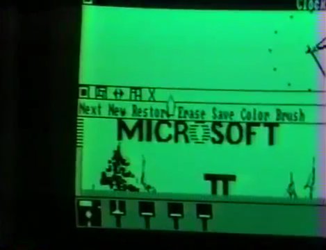
In this version, each window has its own menu at the top. The menus are still stuffed with options, and do not use the "File" menu organization. Instead of sub menu options displaying a completely new menu in the menu area, this version has drop down menus. Or "Pop Down" menus as they call them. |
 ..
.. ..
.. ..
..