|
|
Location: GUIs >
Windows >
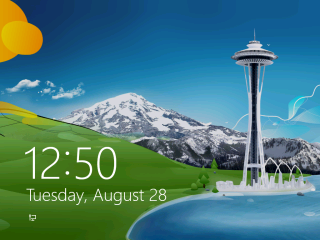
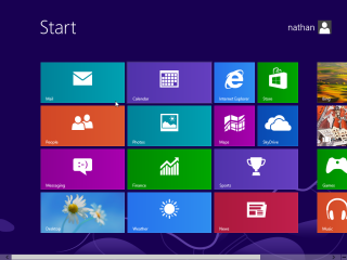
Windows 8 Screen Shots (NT 6.2) (NT 6.2) Screen Shots  Microsoft recently released Windows 8. I had joked about what Windows 8 might be like, but it lived up to the promises that Microsoft would make it "all different" to the point it isn't like anything anybody would expect. Wow, this is complete crap. Where to even start? To put it simply, Microsoft has draped a beginner's user interface (Metro) over the existing GUI. Such "beginners" user interfaces have been tried many times in the past such as GEOS 1.2, At Ease, and Microsoft BOB. Each time they failed because such user interfaces do not provide the power or flexibility of a proper windowing interface that beginners will eventually grow to need. Windows 8 totally pisses in the face of over 30 years of user interface research. It follows almost every one of my "Good User Interface Design Tips" as if Microsoft found that page and didn't realize the entire thing is sarcastic. The first thing Windows displays at bootup is the "lock screen". As if this were some toy cell phone. It fails to tell you what you should do next, so it may leave you scratching your head waiting for something to happen. Clicking anywhere on this screen proceeds to the login screen. Once logged in it displays the "start page".
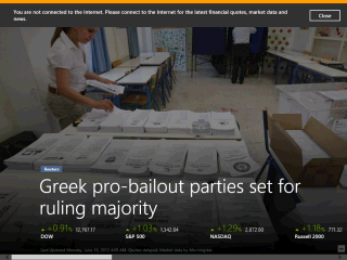
It is all advertising! No, really, every one of these leads to something that requires Microsoft's internet services. This feels like Windows 98 all over again. This "interface" consists of a bunch of tiles, some which animate, that you can drag around the screen with the mouse or a touch screen. Now I hate to burst your bubble, but touch screens are NOT new. There were amber CRTs with touch screens back in the 1980s, and other similar forms of input even earlier than that. It has been proven over and over again that touch screens make make very poor input devices for destkop computers.
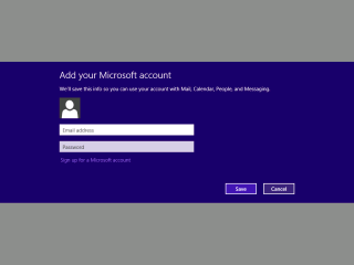
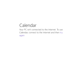
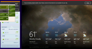
I should be able to start a simple calendar "app" and enter a few dates without Microsoft looking over my shoulder, right? Nope! Every "app" wants you to connect to the internet and log in to Microsoft's "Microsoft Live" internet service.
The only option these screens gives you is to "try again". Your only visible option is to stay stuck in a loop going back and forth between the two screens forever until you give in to the will of Microsoft. Even ignoring that this is all advertising, it violates all kinds of user interface principals out the yingyang:
At least ALT+F4 still works.
Lets see...
Portrait or non wide screen monitor? Only one "app" for you! Why did we even bother inventing the GUI in the first place?! Or visible buttons to click on? How about visible menus to choose options from? With Windows 8 we all get to go back to full screen DOS programs and memorizing keyboard commands!!! On top of all this Microsoft had the audacity to rename "Metro" to "Modern UI" at the last minute! This is NOT "modern"! Not even in any sick twisted sense of the word. Therefore I refuse to refer to it as "Modern UI", but only as "Metro" (or "crap"). The scary things is MS lovers will happily emulate this crap in their own applications. Which brings back bad memories of 1998 desktop programs full of senseless throbbers and embedded browser windows. Another keyboard shortcut to remember: start key + ">" Or blindly click and drag from the upper right corner, as shown in the screenshot.
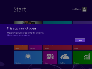
All of the Metro apps stick their nose up and refuse to run at this resolution. Cry me a river and get off my lawn! I grew up on 256*192 in 16 glorious colors... on a blurry 14" TV screen, with RF interference both ways!
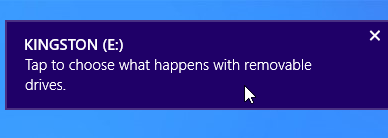
This appears when a drive is attached. They expect us to all have touch screens? Oh, I see Microsoft is trying to sell monitors now. |
