|
|
Location: GUIs >
Apple >
MacOS X Version 10.3.4
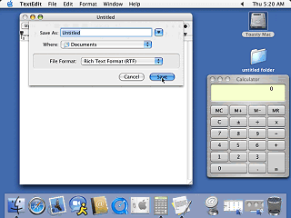
This screen shot shows TextEdit displaying its "Save As" dialog. It is still possible to save items to the desktop, but it seems as if desktop icons are not as important in MacOS X. With the applications installed here anyway the only "new" item that can automatically be created from the finder is a new folder. It seems generally there is less of an emphasis these days on having a desktop that is designed around creating documents and more of an emphasis on running applications that do not create anything. In fact using a modern Mac with MacOS X feels quite like using a stereo or a VCR. Other applications may provide a way of creating new blank documents but textpad and the others items pre-loaded here do not.
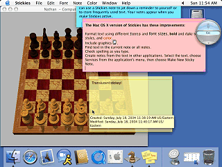
There are also many other Apple applications that can be optionally installed with MacOS X such as iChat, iCal, and iMovie.
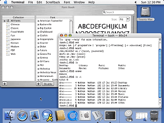
Also shown is the Terminal (warning, this may scare small children) that shows how MacOS X is based on BSD Unix. What, no brushed metal look for the terminal?! Gripes: There are a couple of behaviors of the MacOS X user interface that I disagree with. Let's watch a Microsoft Window user try to move things around on the dock and desktop....
I hate to be negative about the Mac, but one thing that irritates me about the dock is that dragging icons out of the dock causes the icons to be deleted - without any confirmation or warning. And this action can not even be undone! This can be quite a shock to Windows users who expect that this action would result in the icon being moved to the desktop. These icons can not be moved to the desktop or trash as they are not stored aliases or shortcuts but rather as a special configuration setting. This raises the question as to why this is not implemented using a folder of aliases. MacOS 7-9 used folders of aliases to implement similar features. This action should still be undoable. It should be obvious to anyone that a user interface should never permanently delete things without warning, especially in a situation where such an action can occur easily. The sidebar in the new finder also has a similar flaw. Apple is not the only one to do this, a similar thing happens in Microsoft Outlook with column headers making it easy to accidentally lose column headers when trying to simply rearrange them. On a more physical part of the interface, why does Apple feel that they should not put an eject button on their CD drives? It seems like they think this is "fancy", but every other CD or DVD player in the universe has an eject button somewhere on it. Apple did put an eject key on the keyboard, but that is physically dislocated from the action you are trying to perform. And dragging a disk to the trash to eject or disconnect from it is still a dumb idea (On MacOS X the trash icon changes to an "eject media" icon when you start dragging a CD icon but still...) And just to clarify, since so many people seem to be confused, what
I would like an eject button to do is the exact same thing as dragging
the disk icon to the trash or pressing the eject key on the keyboard. These
behave as a software "eject request" that allows the OS to attempt to close
all open files first. If the OS is unable to close all files then it can
refuse to eject the disk. All standard CD drives and most other modern
removable media drives have the hardware support for this.
|


