|
|
Location: GUIs >
Windows >
Windows 95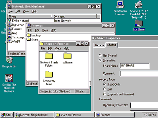
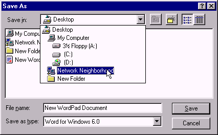
A very useful addition in Windows 95 is its ability to share and browse network resources graphically. The Network Neighborhood contains a list of computers and their resources in the current workgroup. If you open a file share it looks and behaves just like a local folder - only no messy drive mounting or mapping involved. Just click and go. If you open a remote printer Windows automatically copies the driver, if one is available, from the remote computer and puts a printer icon in your printers folder. Unfortunately some drivers were not fully compatible with this.
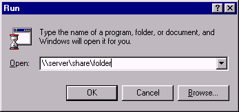
You can also access shares directly by entering a "UNC" name. Click Start then Run, and type a path like "\\server\share\folder". And there are your files! Similarly when opening or saving a file from an application you can type in a file name like "\\server\share\folder\mydoc1", and there it is! Sharing folders is easy. Just right-click on a folder, click "Sharing", and set a few options. A small hand appears under each shared folder indicating it is shared. (A little too easy perhaps, due to a bug in the original release it technically possible to access the entire hard drive through any file share!)
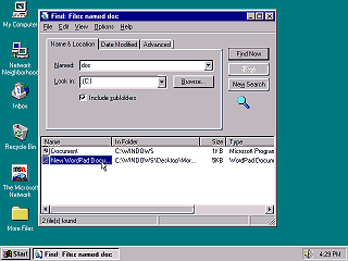
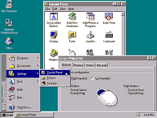
Enter a partial file name and it will search the entire selected drive for matches. You can also search by file size and date ranges. Under the "advanced" tab, you can search for files containing specified text. Unlike Windows XP or later it will search inside every file including file types it does not specifically know about. The results are displayed in a folder like window where you can open, copy, or delete them. The Windows 95 control panel displays as a list of icons within the Windows Explorer. This makes it look more like the control panel on the classic MacOS, but it is not an actual file folder. Most of the control panel applets use a tabbed dialog style somewhat similar to what OS/2 made popular. Most control panel dialogs and property pages have both an "OK" and "Apply" button. The Apply button applies any changes immediately, while the OK button applies and closes the dialog. This is needed because some control panel dialogs have many options that you may not want to apply all at once.
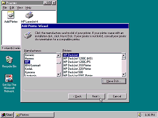
A "wizard" is usually a dialog box that walks you through each specific step needed to complete the operation. Typically a wizard presents a few discrete choices at a time across several pages you can navigate with a "Back" and "Next" button. The last page will usually have a "Finish" button that completes the task using your selected choices.
In the days of 160k single sided floppies this was a reasonable limit, but in the age of multi-megabyte hard drives... not so much. Other OSes and shells previously attempted to add long file names or descriptions to the DOS FAT file system. This usually involved extra files containing the long filename information, because only Microsoft controlled the specifications of the FAT filesystem. In Windows 95 and NT Microsoft managed to store the long filenames directly within the FAT filesystem in a way that was mostly still compatible (using short file names) with DOS and other OSes.
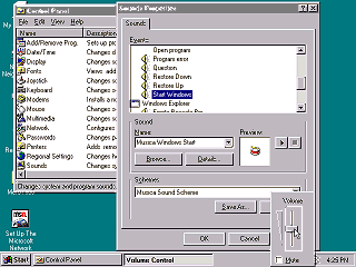
You can select specific individual sounds or select one of several "Sound Schemes" included with Windows 95. Playing a sound every time you click a menu item might seem nuts, but there were numerous third party applications for Windows 3.1 at the time that added similar sound effects.
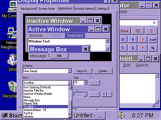
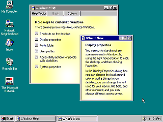
In addition to just changing colors, you can change the size of icons, fonts, scroll bars, and other window metrics. Applications that use the standard Windows user interface controls instantly conform to the specified appearance. Part of this have to do with usability for visually impaired, larger screens, smaller screens, and just looking cool. The Windows Help application is based on the one in Windows 3.0, but the style of help files created by Microsoft has changed drastically. Windows 95 help windows will jump around, resize, or even close when you click on buttons or links. The idea is that it conserves desktop space, letting the user read the help and use the application at the same time. In practice, it makes users dizzy. Unfortunately you can not browse these kinds of help files like a book. You must constantly go to the index dialog to open topics.
|
