|
|
Location: GUIs >
Apple >
Mac OS X Version 10.5 Screen Shots  So I kicked around the new version of Mac OS X commonly referred to as "Leopard". Doing a clean install was a breeze. Setup runs through the typical setup options. Like 10.4 it tries to force you to sign up for a ".Mac" account on Apple's web site with no visible way to skip it but "command-Q" lets you skip it anyway. At least there is no retarded activation or anything like that.
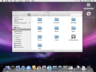
Of course Apple changed the over all visual appearance. There is no more "pinstripe" texture anywhere, and the dock has a new 3D look. The dock has reflections too! The brushed metal look that the Finder and some other apps used has also been eliminated. There are now more items in the sidebar on the Finder and they are organized in to collapsible groups. And they try to sell you on their iDisk service by placing an icon for it prominently in the sidebar.
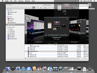
In CoverFlow view, the Finder displays large previews of each file that fly across the screen in 3D as you scroll through them. You can use these huge previews as you would regular icons, dragging them around or opening them. Some file types such as Quicktime videos can play directly in CoverFlow view. This is a very, very cool looking feature, but I am not sure how it is supposed to be useful. I guess the larger previews can make it easier and quicker to see what is in a document or group of documents without having to open them. Hmmm, that would be very useful for organizing my porn.
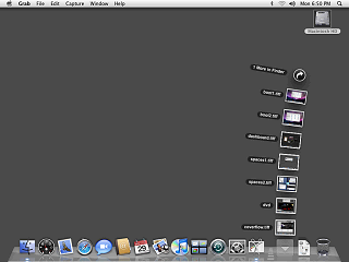
By default Mac OS X 10.5 adds your documents folder and the downloads folder to the dock as stacks. Apparently the operation of these stacks is so intuitive that Apple needed to include a full page document about it in each of the default stacks. In previous versions of Mac OS X you could click on such folders to bring up a menu. This replaces that functionality entirely. Which is kind of unfortunate as there is no way scroll through the content (it will only show so many items) or to open a subfolder within a fan or grid. These actions must open a Finder window.
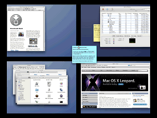
Once turned on, "Spaces", as they are called in Mac OS X 10.5, lets you switch between different desktops opening different applications in each. You can preview all of the desktops at once and even drag and drop applications from one desktop to another.
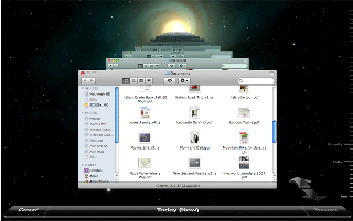
To use Time Machine you MUST have a dedicated hard drive or hard drive partition. A flash drive or network drive will not do. Guess what I don't have. |
